Historical Graphs
Historical charts (hereinafter simply graphs), unlike trends, allow you to save your data in an archive, the depth of which is set in Setup_System settings menu Setup / Settings, 'Keep data' in log for (max 5 years). Theoretically, the volume of the archive is limited only by the size of the flash card.
In practice, when the archive size is increased by more than 300MB, the 'response time' in the interface when working with WebHMI can increase and affect the comfort of the user's work. It should be said that storing large amounts of data is not the target application of the device, although it allows it to do so. These graphs should be used during the research stage of the monitoring object, keep the archive for analysis of certain situations (which after use can be deleted), etc. For long-term storage of a large amount of monitoring data, it is recommended to use a special server - via the API or the 'cloud' server option.
To create a graph, you need to select the menu item Setup / Graphs. The creation interface here is the same as in Trend Trends, except that only registers with the option 'Save data for graphs' will be displayed in the register list (see work with registers ).
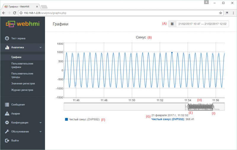
An example of a graph.


Elements of the graph:
- (А) - calendar for selecting date/period of view
- (В) - Graph title, set in menu
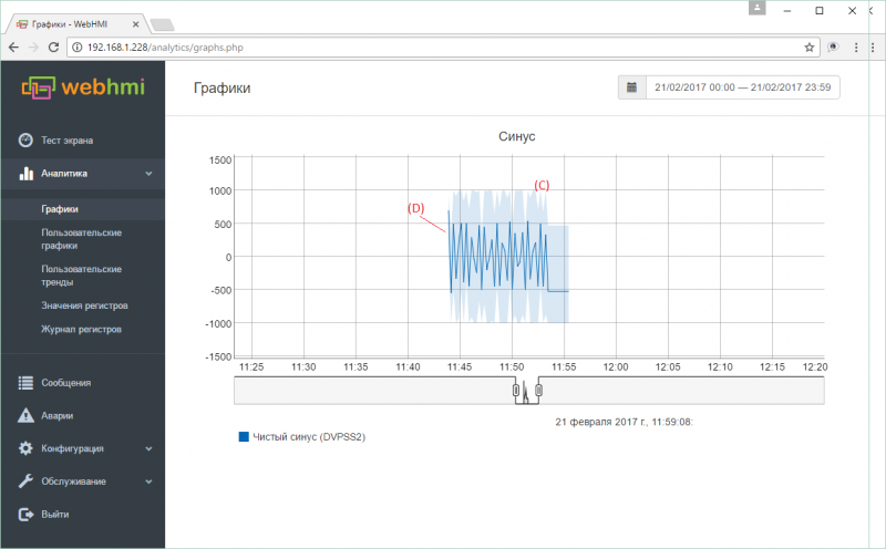
- (C) - A semitransparent color draws a range of values that the selected register took on a given plot section.
- (D) - Line of averaged values. In the case when for a selected plot scale 1 minute or more will fit into 1 pixel of the screen, then the average values of the register and the zone (C) of the range of values for estimating the distribution of the minimum and maximum peaks will be displayed on the graph. This averaging is drawn using cached data from the database, corresponding to the current scale of the view (in the database, averaging is stored for 1, 2, 5, 15 and 60 minutes). This method allows you to optimize the work with graphs when viewing large amounts of data on a different scale, while maintaining the speed of work. See below the features of working with charts.
- (Е) - slider of the viewport left border
- (F) - list of parameters displayed on the graph with the corresponding colors
- (G) - display time and parameters of the corresponding current cursor position on the line of average values on the graph (bold dot)
- (H) - viewport. By setting the desired scale of this window with the help of the left and right sliders, you can move the window along the time axis, thus choosing the interval of interest with the same time scale
- (I) - slider of the viewport right border
Features of data display on graphs
When displaying data on the graphs, if the values change much more often than the selected display scale, it is possible to get a distorted representation of the value changes. For example, the above graph is actually, when choosing the right scale, (when there is no area (C)) looks like this.
 It is seen that different values coexist on the same point of the cursor (the same instant of time) in different scales.This happens when you try to hit the point with a resolution of 1 sec. on the chart with the current one with a scale of 1 minute. In this case, the cursor will show the averaged value (see the description of item (D) above).
Thus, to obtain accurate information about the value of a parameter at a given time, it is always necessary to select the appropriate scale.
Viewing data on a large scale allows you to qualitatively assess the situation with the parameter - the presence of noise, peaks, etc. those. determine the moments of interest and then analyze them on a scale.