Экраны/en — различия между версиями
(Новая страница: «== Creating dashboards == In WEBHMI, screens or dashboards (Dashboards) are analogous to screens for operator panels or graphic screens in SCADA systems. You can…») |
|||
| (не показано 17 промежуточных версий этого же участника) | |||
| Строка 1: | Строка 1: | ||
| + | <languages/> | ||
== Creating dashboards == | == Creating dashboards == | ||
| − | |||
In WEBHMI, screens or dashboards (Dashboards) are analogous to screens for operator panels or graphic screens in SCADA systems. You can create multiple screens that will be available after you create the '''Dashboard''' menu. For example, create the 'Dashboard 1' screen, using the menu item 'Configuration / Screens Setup / Dashboards'.<br> | In WEBHMI, screens or dashboards (Dashboards) are analogous to screens for operator panels or graphic screens in SCADA systems. You can create multiple screens that will be available after you create the '''Dashboard''' menu. For example, create the 'Dashboard 1' screen, using the menu item 'Configuration / Screens Setup / Dashboards'.<br> | ||
[[Файл:Создать панель.png|800px]] | [[Файл:Создать панель.png|800px]] | ||
<br> | <br> | ||
| − | + | Go to the visual editor of the screen in two ways: by clicking the button in the list of dashboards, or by clicking the button, while on its page.<br> | |
[[Файл:Edit via list.png|600px]]<br> | [[Файл:Edit via list.png|600px]]<br> | ||
| − | + | or so:<br> | |
[[Файл:Edit option 2.png|800px]]<br> <br> | [[Файл:Edit option 2.png|800px]]<br> <br> | ||
| − | + | Appearance of the new dashboard panel in the editing mode:<br> | |
[[Файл:Empty dash.png|800px]]<br><br> | [[Файл:Empty dash.png|800px]]<br><br> | ||
| − | + | After that, you can proceed with the layout of the visualization elements on the dashboard. The necessary elements are placed on the field by 'dragging' them from the toolbar. | |
| − | <p> | + | <p>The toolbar has 3 tabs: |
| − | ::'''Controls''' - | + | ::'''Controls''' - list of controls |
| − | ::'''Properties''' - | + | ::'''Properties''' - properties of the currently edited item |
| − | ::'''Group''' - | + | ::'''Group''' - group operations, is activated when more than two items are selected |
</p> | </p> | ||
| − | + | After selecting a group, the following operations are available through the tab ''Group'':<br> | |
[[Файл:Выравнивание.png|400 px]] <br> | [[Файл:Выравнивание.png|400 px]] <br> | ||
| − | + | The following kinds of visualization elements are available: | |
| − | ::''' | + | ::'''Indicator - LED''' |
| − | ::''' | + | ::'''Text''' |
| − | ::''' | + | ::'''Text edit box''' |
| − | ::''' | + | ::'''Images''' |
| − | ::''' | + | ::'''Video - streams''' |
| − | ::''' | + | ::'''Buttons''' |
| − | ::''' | + | ::'''Progress indicators''' |
| − | ::''' | + | ::'''Gauge''' |
| − | ::''' | + | ::'''Slider''' |
| − | ::''' | + | ::'''Group''' |
| − | ::''' | + | ::'''Message table''' |
| − | ::''' | + | ::'''Trends''' |
| − | + | The editing field has a grid with a step of 40 pixels (the grid step can be redefined in the properties of the screen), by which the elements will be aligned. If necessary, align the object more accurately, this can be done by holding '' Shift ''. | |
| − | + | ||
| − | + | ||
| − | == | + | <p> When editing, the following 'hot keys' are supported - <br> |
| − | + | ''Ctrl+A'' (select all), ''Ctrl+C'' (copy), ''Ctrl+V'' (paste), ''Ctrl+X'' (cut), ''Ctrl+D'' (cancel selection). Also, you may select control elements with the clicking on desired elements with ''Ctrl'' pressed.</p> | |
| + | |||
| + | == Text elements == | ||
| + | Elements of the text allow placing them on the dashboard either as a static text (or register value), or the line that makes up them. If there are units of measurement in register properties, they will also be displayed after the value of the register. Setting the 'Allow change value' attribute turns the text into a field for entering a value into the register. A text element can also inherit color signaling of the state of the register. There are 5 variants of font size (in relative units) and 5 layers (the layer with the larger number is closer to the user looking at the screen). Text can also be a convenient reference to another dashboard, trend or graph. See Fig .: <br> | ||
[[Файл:Текст редактирвоание .png|800px]]<br><br> | [[Файл:Текст редактирвоание .png|800px]]<br><br> | ||
| − | == | + | == Indicators - LED== |
| − | + | LED indicators are a convenient ready-made element for indicating the discrete state of the register. Below is a description of its settings.<br> | |
[[Файл:Led .png | 800 px]] | [[Файл:Led .png | 800 px]] | ||
| − | == | + | == Edit box == |
| − | + | Although the values of parameters displayed on the screen in the form of text can be changed using the attribute 'allow to change the value', sometimes it is more convenient for the user to differentiate the values of the parameters viewed only and those whose values can be changed. | |
| − | + | The edit box allows you to specify a frame, a background for such parameters, and highlights the value and undo buttons. | |
<br clear=all> | <br clear=all> | ||
[[Файл:Edit box.png | 800 px]] | [[Файл:Edit box.png | 800 px]] | ||
| − | == | + | == Images== |
| − | + | It is possible to put images from the image library onto the dashboard. Image may serve for several functoins - | |
| − | * | + | *just an image as visual element |
| − | * | + | *object state indicator - ON/OFF, color state signalling |
| − | * | + | *as a control element, like button, which after being pressed can change register value |
| − | * | + | *dynamic element - moving along axis or change visibility |
| − | + | To add an image to the library, they must first be downloaded there via the menu '''Setup/Image library'''.<br> | |
[[Файл:Image adding.png|800px]]<br> | [[Файл:Image adding.png|800px]]<br> | ||
| − | === | + | === Images as indicators === |
<p> | <p> | ||
| − | + | One of the image functions can be the display of the color signaling of register states(states), </p> | |
| − | + | In order for all states to look the same throughout the project, it is desirable to use the default colors that are offered when describing states (although they can also be redefined). It is also desirable to perform normalization of images for indicators (see the description of the option in the 'Images' section). | |
| − | + | An example of using the indicator is given below. | |
| − | <p> | + | <p>The indicator in this case is the thermometer icon (see the image section), which is tied to a register that has configured alert states. </p> |
| + | |||
[[Файл:Индикатор температура 2.png|800px]] <br> <br> | [[Файл:Индикатор температура 2.png|800px]] <br> <br> | ||
| − | + | The image becomes an indicator after the register is associated with the color alarm set. | |
| − | == | + | == Video streams == |
| − | + | On the dashboard, you can place a video stream object that must previously be configured in the Setup / Video Stream menu. See Fig. below: | |
| + | <br> | ||
[[Файл:Видеопоток.png | 800px]] | [[Файл:Видеопоток.png | 800px]] | ||
| − | == | + | == Buttons == |
| − | + | Button fuctions | |
| − | * | + | *link to another page |
| − | * | + | *programs (script) or recipe activation upon press/release |
| − | * | + | *register value associated with the button |
| − | + | Below is a description of the fields for setting the button: | |
<br clear = all> | <br clear = all> | ||
[[Файл:3Д кнопка без привязки к регистру .png | 800px]] <br> | [[Файл:3Д кнопка без привязки к регистру .png | 800px]] <br> | ||
| − | == | + | == Progress indicators == |
| − | + | The values displayed by these elements are represented in the form of bar indicators, which are a convenient graphical representation of the parameter value, allowing to quickly estimate its current value to the operator. | |
<br clear = all> | <br clear = all> | ||
[[Файл:Progrerss bar1.png|800px]] | [[Файл:Progrerss bar1.png|800px]] | ||
| − | == | + | == Gauges== |
| − | + | The gauges(sensors) are generally similar to the progress bar with the following difference: the value in the register associated with the sensor affects the position of the slider that is next to the main figure. When the '' Colorize '' option is turned on, the portion of the scale that is defined as the state will be painted. | |
| − | + | Sensor settings are similar to the settings for the elements of the progress bar, except for one field (the size of the pointer). | |
| − | + | The sensor will not display values outside this range. | |
<br clear = all> | <br clear = all> | ||
[[Файл:Датчик создание.png|800px]] | [[Файл:Датчик создание.png|800px]] | ||
| − | == | + | == Sliders== |
| − | + | The slider allows you to enter a value into the register by moving the slider. The settings are shown in Fig. | |
<br clear = all> | <br clear = all> | ||
[[Файл:Slider.png | 800 px ]] | [[Файл:Slider.png | 800 px ]] | ||
| − | == | + | == Group == |
| − | + | The group allows you to select several elements bound by a common function, place, or otherwise. The group can also specify the title, background, border thickness and color, etc. See Fig .:<br> | |
[[Файл:Группа.png | 800px]] | [[Файл:Группа.png | 800px]] | ||
| − | == | + | == Message table == |
| − | + | The message table allows to output messages generated with the AddInfoMessage, AddWariningMessage, AddAlertMessage (see [http://wiki.webhmi.com.ua/index.php/Скрипты#AddInfoMessage.28message.2C_userId.29 description link]) onto the dashboard. | |
| − | + | The table settings are below:<br> | |
[[Файл:Таблица сообщений.png | 800px]] <br> | [[Файл:Таблица сообщений.png | 800px]] <br> | ||
| − | |||
| − | == | + | == Trend for dashboard == |
| − | + | The trend can also be placed on the dashboard. This type of trend has a limit on the number of displayed parameters (3 for version 1.11.0.3491). Trending panel for the dashboard: | |
<br clear = all> | <br clear = all> | ||
[[Файл:Тренд.png | 800 px]] | [[Файл:Тренд.png | 800 px]] | ||
Текущая версия на 11:19, 23 ноября 2017
Содержание
Creating dashboards
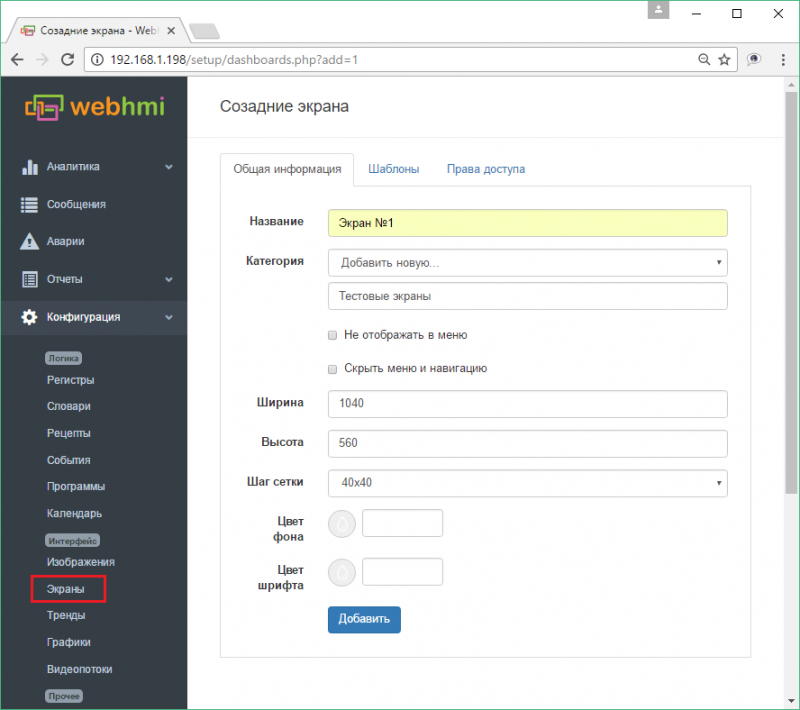
In WEBHMI, screens or dashboards (Dashboards) are analogous to screens for operator panels or graphic screens in SCADA systems. You can create multiple screens that will be available after you create the Dashboard menu. For example, create the 'Dashboard 1' screen, using the menu item 'Configuration / Screens Setup / Dashboards'.
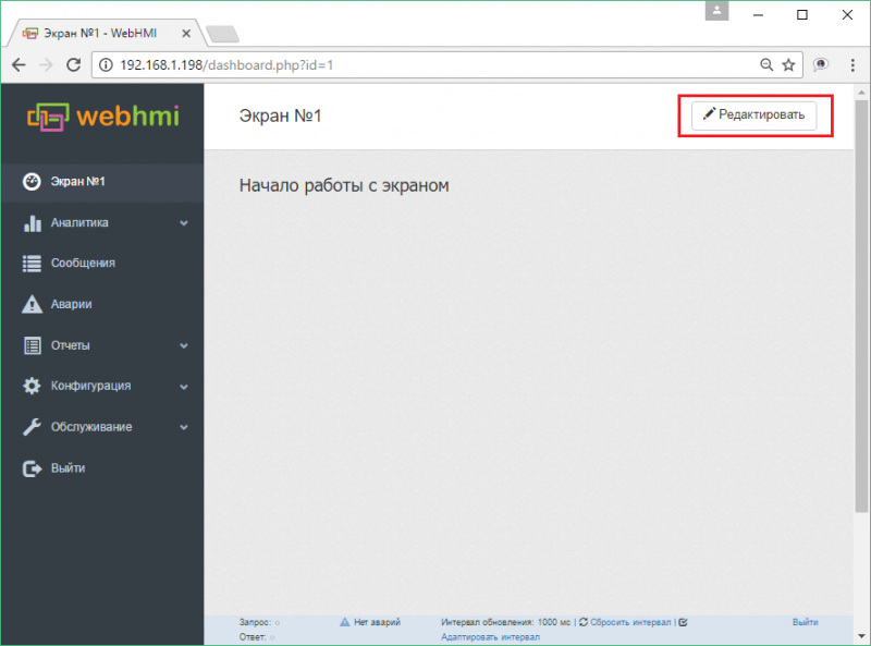
Go to the visual editor of the screen in two ways: by clicking the button in the list of dashboards, or by clicking the button, while on its page.

Appearance of the new dashboard panel in the editing mode:
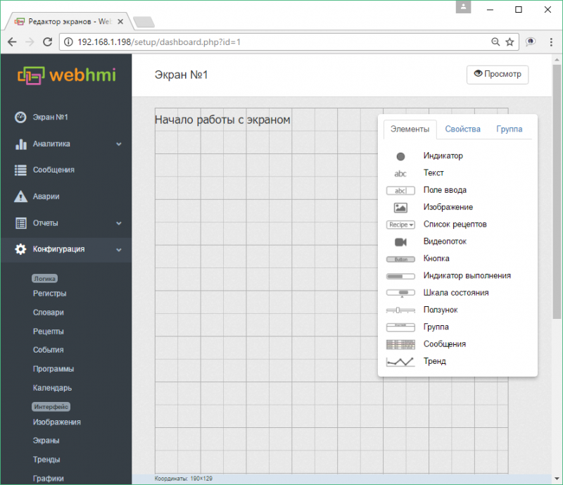
After that, you can proceed with the layout of the visualization elements on the dashboard. The necessary elements are placed on the field by 'dragging' them from the toolbar.
The toolbar has 3 tabs:
- Controls - list of controls
- Properties - properties of the currently edited item
- Group - group operations, is activated when more than two items are selected
After selecting a group, the following operations are available through the tab Group:
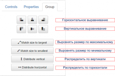
The following kinds of visualization elements are available:
- Indicator - LED
- Text
- Text edit box
- Images
- Video - streams
- Buttons
- Progress indicators
- Gauge
- Slider
- Group
- Message table
- Trends
The editing field has a grid with a step of 40 pixels (the grid step can be redefined in the properties of the screen), by which the elements will be aligned. If necessary, align the object more accurately, this can be done by holding Shift .
When editing, the following 'hot keys' are supported -
Ctrl+A (select all), Ctrl+C (copy), Ctrl+V (paste), Ctrl+X (cut), Ctrl+D (cancel selection). Also, you may select control elements with the clicking on desired elements with Ctrl pressed.
Text elements
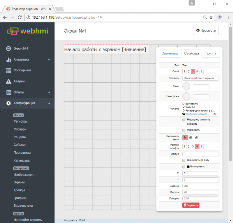
Elements of the text allow placing them on the dashboard either as a static text (or register value), or the line that makes up them. If there are units of measurement in register properties, they will also be displayed after the value of the register. Setting the 'Allow change value' attribute turns the text into a field for entering a value into the register. A text element can also inherit color signaling of the state of the register. There are 5 variants of font size (in relative units) and 5 layers (the layer with the larger number is closer to the user looking at the screen). Text can also be a convenient reference to another dashboard, trend or graph. See Fig .:
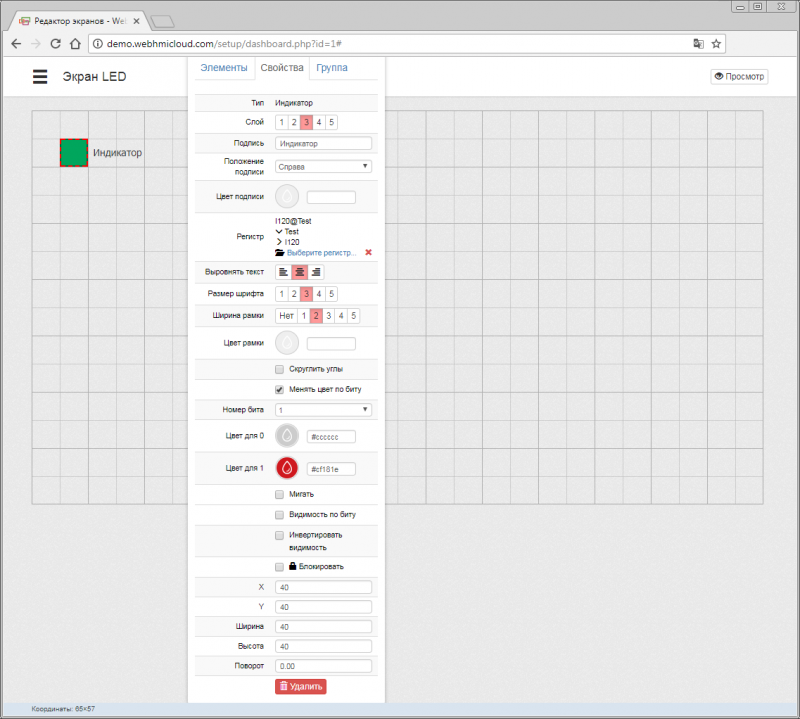
Indicators - LED
LED indicators are a convenient ready-made element for indicating the discrete state of the register. Below is a description of its settings.
Edit box
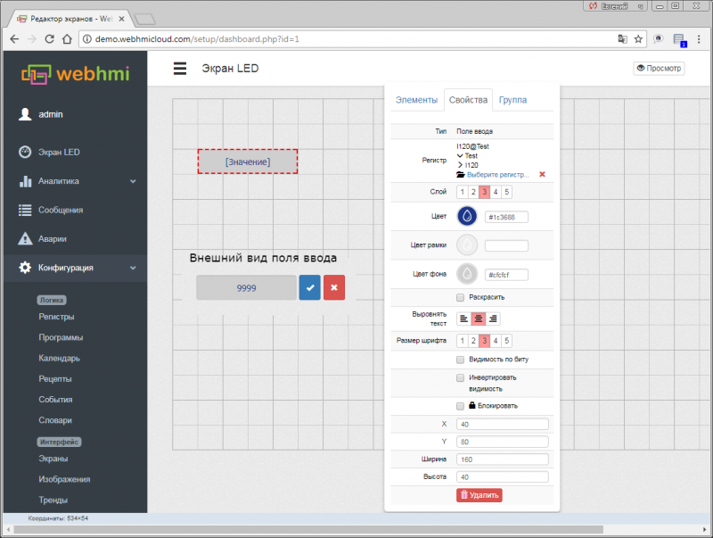
Although the values of parameters displayed on the screen in the form of text can be changed using the attribute 'allow to change the value', sometimes it is more convenient for the user to differentiate the values of the parameters viewed only and those whose values can be changed.
The edit box allows you to specify a frame, a background for such parameters, and highlights the value and undo buttons.
Images
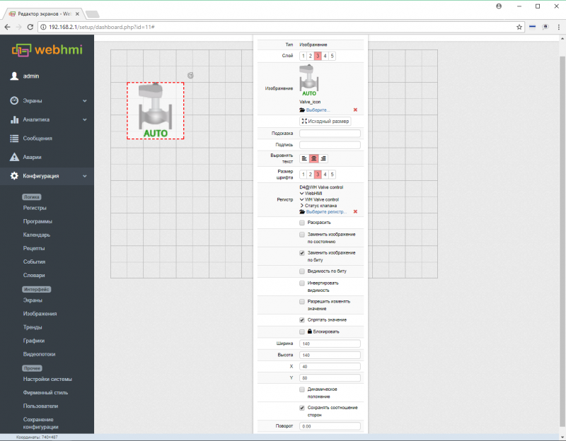
It is possible to put images from the image library onto the dashboard. Image may serve for several functoins -
- just an image as visual element
- object state indicator - ON/OFF, color state signalling
- as a control element, like button, which after being pressed can change register value
- dynamic element - moving along axis or change visibility
To add an image to the library, they must first be downloaded there via the menu Setup/Image library.
Images as indicators
One of the image functions can be the display of the color signaling of register states(states),
In order for all states to look the same throughout the project, it is desirable to use the default colors that are offered when describing states (although they can also be redefined). It is also desirable to perform normalization of images for indicators (see the description of the option in the 'Images' section). An example of using the indicator is given below.
The indicator in this case is the thermometer icon (see the image section), which is tied to a register that has configured alert states.
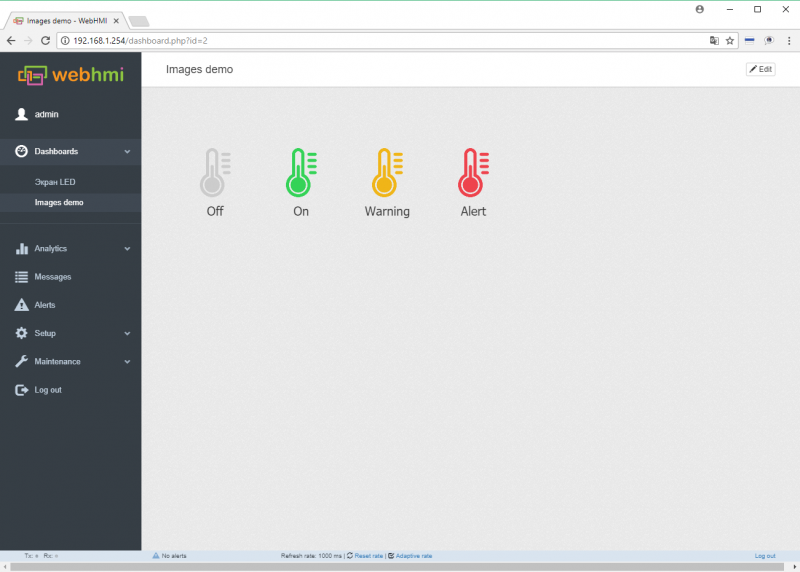
The image becomes an indicator after the register is associated with the color alarm set.
Video streams
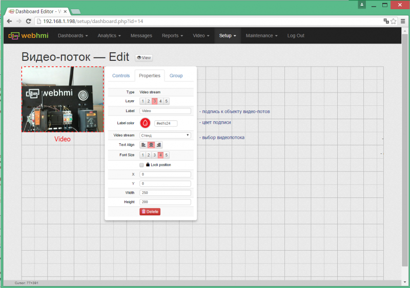
On the dashboard, you can place a video stream object that must previously be configured in the Setup / Video Stream menu. See Fig. below:
Buttons
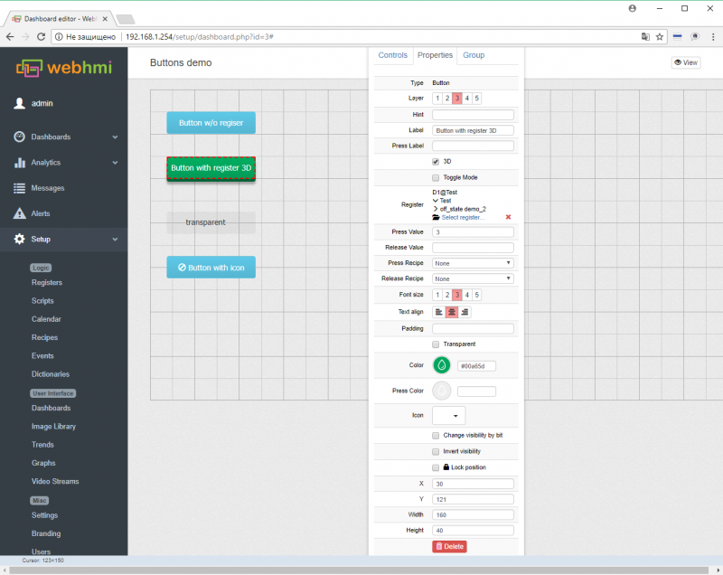
Button fuctions
- link to another page
- programs (script) or recipe activation upon press/release
- register value associated with the button
Below is a description of the fields for setting the button:
Progress indicators
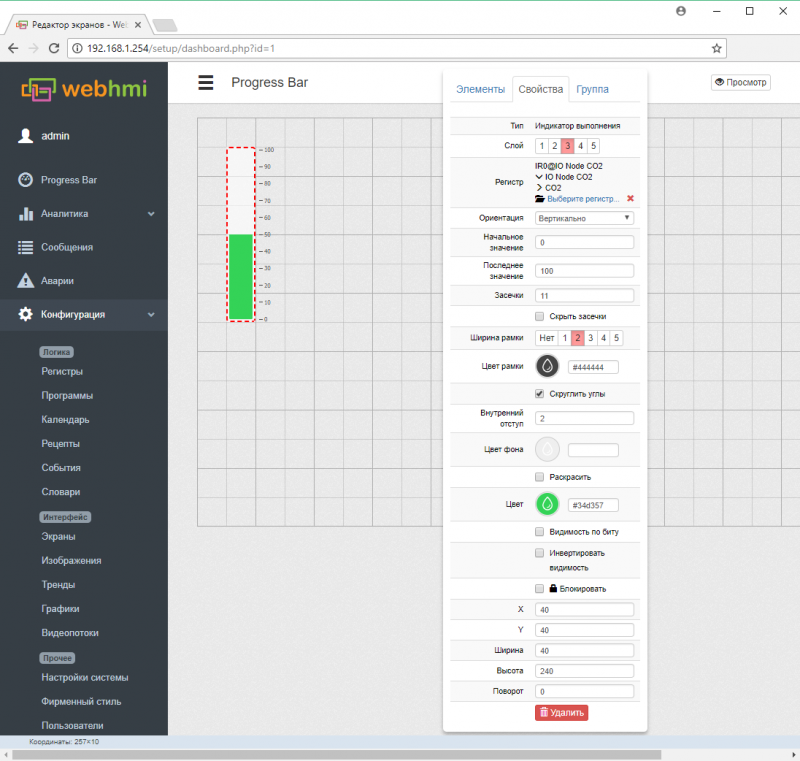
The values displayed by these elements are represented in the form of bar indicators, which are a convenient graphical representation of the parameter value, allowing to quickly estimate its current value to the operator.
Gauges
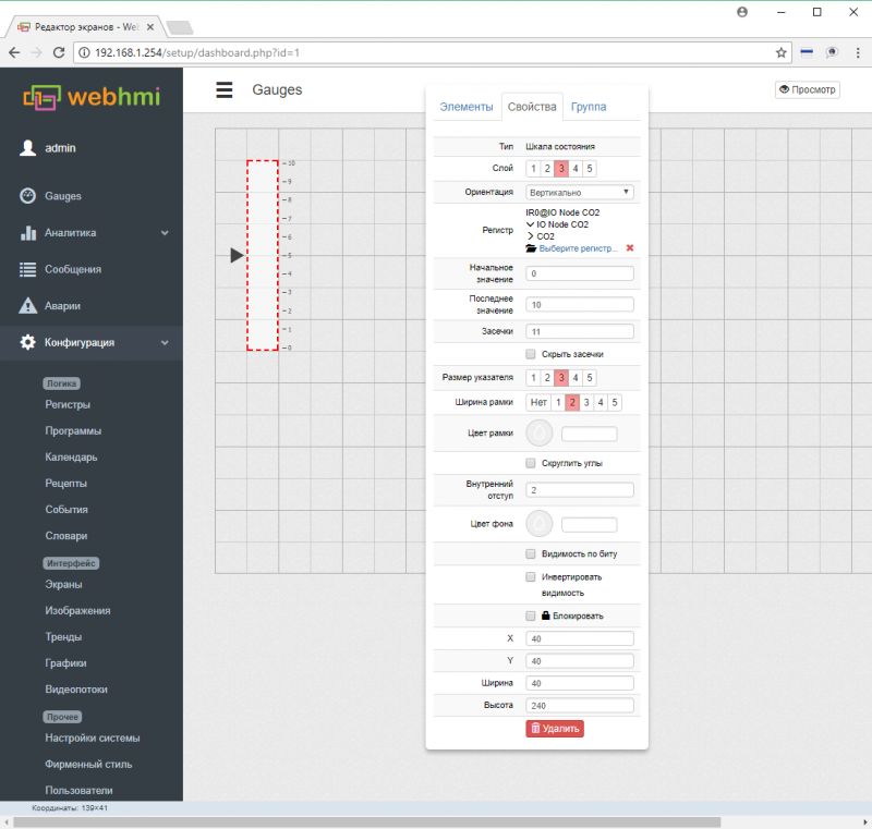
The gauges(sensors) are generally similar to the progress bar with the following difference: the value in the register associated with the sensor affects the position of the slider that is next to the main figure. When the Colorize option is turned on, the portion of the scale that is defined as the state will be painted.
Sensor settings are similar to the settings for the elements of the progress bar, except for one field (the size of the pointer).
The sensor will not display values outside this range.
Sliders
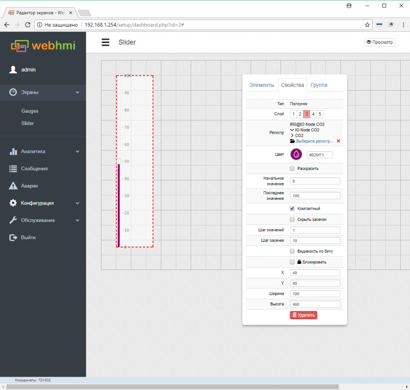
The slider allows you to enter a value into the register by moving the slider. The settings are shown in Fig.
Group
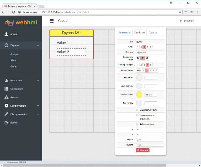
The group allows you to select several elements bound by a common function, place, or otherwise. The group can also specify the title, background, border thickness and color, etc. See Fig .:
Message table
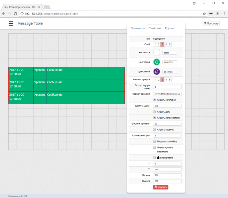
The message table allows to output messages generated with the AddInfoMessage, AddWariningMessage, AddAlertMessage (see description link) onto the dashboard.
The table settings are below:
Trend for dashboard
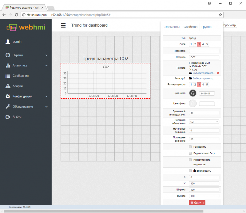
The trend can also be placed on the dashboard. This type of trend has a limit on the number of displayed parameters (3 for version 1.11.0.3491). Trending panel for the dashboard:
